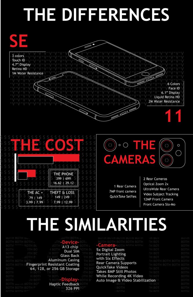
Apple iPhone Comparison Graphic
Role: Designer, Researcher, and Illustrator
Tools: Adobe Illustrator
Audience: New Hires & Customers
Project Overview:
During my time at Apple, I was tasked with creating a graphic to explain the key differences and similarities between the iPhone SE and iPhone 11.
The goal was to provide an easy-to-understand, visually engaging comparison that could serve both internal training needs and external customer education.
The Challenge
Create a one-page graphic that highlights technical specs, pricing, and AppleCare+ coverage.
Ensure the information was clear for two distinct audiences: new hires unfamiliar with Apple products and customers making purchasing decisions.
Overcome a lack of pre-existing assets by recreating scaled visuals of the phones from scratch.

My Process
Research & Content Curation
Sourced data directly from Apple’s website to ensure accuracy.
Focused on including key differences, similarities, and pricing to keep the information focused and relevant.
Visual Design & Layout
Recreated phone images in Adobe Illustrator for precision and accuracy.
Designed with the Project RED partnership in mind, incorporating red accents against a black background for contrast and emphasis.
Organized the content into three clear sections:
- Differences – Highlighted technical distinctions like camera specs and hardware.’
- Similarities – Showcased shared features, providing balanced information.
- Pricing & Coverage – Made costs and AppleCare+ details easy to compare.
Feedback & Iteration
Collected feedback from three peers to validate the clarity of the design and information flow.
Made adjustments to improve readability, balance content, and ensure the layout was visually polished.
The Solution
The final design successfully delivered a clear, accurate, and visually engaging comparison graphic. The layout combined:
Clean visual hierarchy: Red accents and bold titles guided users through the content.
Simplified technical language: Ensured accessibility for both customers and employees.
Scalable visuals: Phone designs remained accurate and consistent with Apple’s branding.
Results & Impact
The graphic was widely shared internally at Apple and recognized as an example of excellent work.
It was used for new hire training to improve product understanding and served as a customer resource for informed decision-making.
Skills Developed
This project allowed me to strengthen:
- Data Visualization: Transforming complex information into a simple, scannable format.
- UX Thinking: Balancing the needs of two user groups through design.
- Design Systems: Applying brand guidelines while adding unique visual storytelling elements.
- Technical Skills: Enhanced proficiency in Adobe Illustrator by recreating assets and solving layout challenges.
Final Thoughts
This project reflects my ability to blend research, design, and storytelling into a cohesive visual solution. It highlights my problem-solving mindset, technical craftsmanship, and user-centered approach to design.